– My roles: Content Designer and UX Writer –
Challenge
The DesignOps team in Fannie Mae’s Customer Experience Design (CXD) group needed a way to show the value of the work designers did across the company’s four business units.
Most evidence of UX improvements made by CXD’s designers was hidden in emails, decks, and other artifacts that stayed with the product teams.
CXD’s DesignOps team wanted a central place to collect metrics, something they could rely on when pitching engagements to new internal partners.
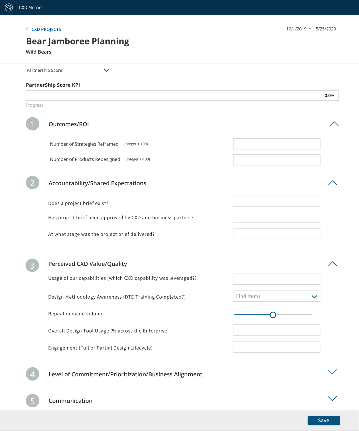
The DesignOps team chose PowerApps and worked with an in-house developer and one of CXD’s UI designers to create a tool. PowerApps limited the design choices they could make. For example, they couldn’t put field labels above input fields as Blueprint, Fannie Mae’s design system, required.
They tested a beta version with a handful of the Design Managers in CXD who would enter results for their teams’ projects.
The feedback: We have no idea what you’re asking us for here. The language makes no sense.
Project Managers in DesignOps had made a crucial, unfortunately common mistake: they’d chosen to omit a content expert from their project team.
They came to me late in the process, desperate for help with what they thought was a nearly finished MVP release.
I looked at the microcopy in the beta version of their tool and knew we’d have a lot of work to do together to improve the user experience.
And we had to improve it fast. They were a month away from a hard launch deadline set by CXD’s Vice President.
Approach
I tested adding a project and entering a Partnership Score, which was the functionality DesignOps wanted to launch as their MVP. I put myself in the mindset of a Design Manager and worked through the tool.
It didn’t take me long to discover why beta testers couldn’t understand what they were being asked to provide in the Partnership Score form.
Most of the labels in the tool were pure jargon. The DesignOps team had provided almost no helper microcopy to guide CXD’s Design Managers as they were filling out the form.

Since their MVP focused on the Partnership Score form, this is where I started.
Plain language Education
The Product Owner in DesignOps was frustrated. The language in the tool made sense to her. She couldn’t understand why her beta testers were having problems.
My first step was to get her to explain each of the sections of the Partnership Score form to me.
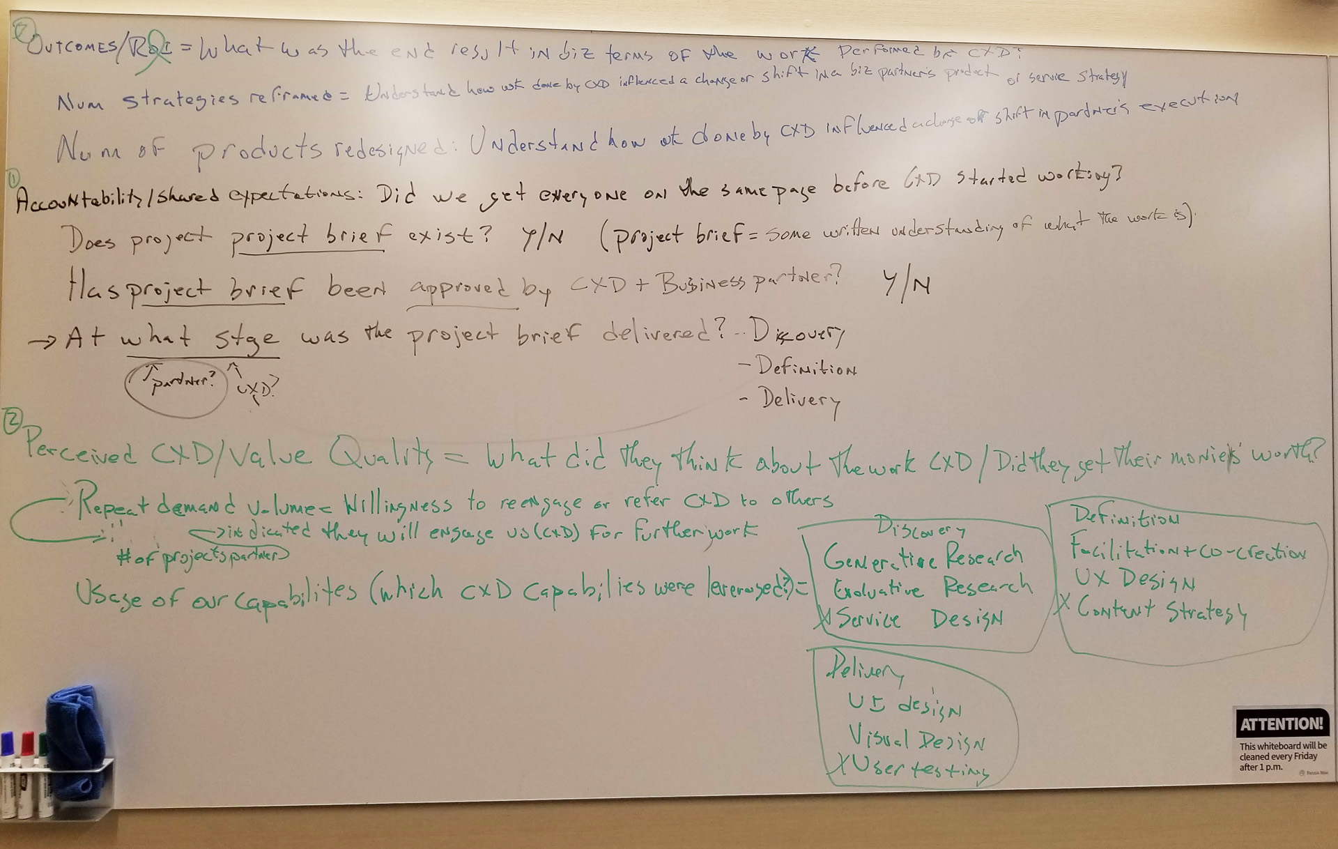
In a collaborative session with the Product Owner and the UI Designer, I wrote the current headings on a whiteboard. I asked the Product Owner what information she was trying to get from CXD’s Design Managers in those sections and in each field.

This exercise allowed us to eliminate jargon and get to the real meaning and metrics our DesignOps team could use.
It also helped us clarify the language the Product Owner was using with her own team.
We talked about the difference between customers – a business who worked with the Fannie Mae as a whole – and a client or partner – a team inside Fannie Mae that CXD worked with to design or iterate a digital product.
And we talked about why plain language and using a term consistently enabled people to get things done.
This new understanding helped the Product Owner move forward with other parts of her work on the same project.
UX writing and Content Design
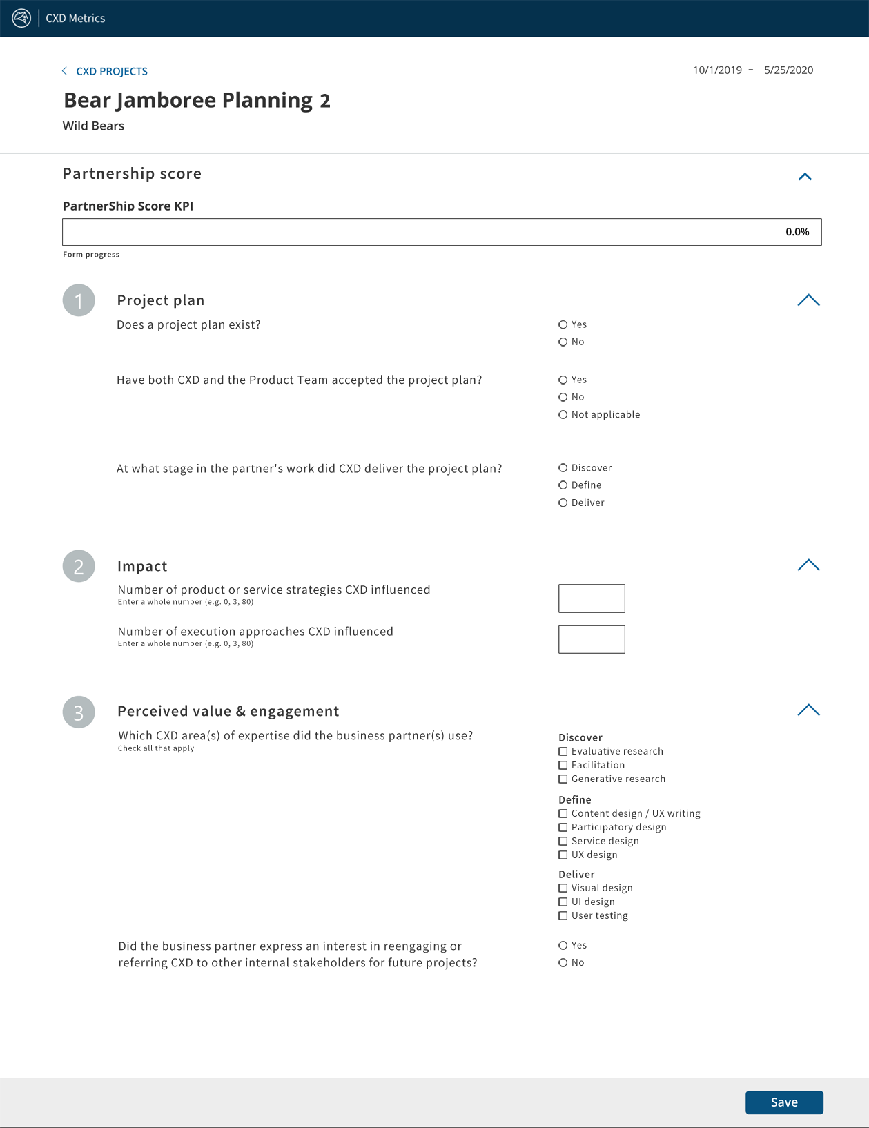
Insight into what the Product Owner wanted gave me a roadmap. I wrote new headings and helper microcopy for the tool that would enable Design Managers to:
- Understand what information they needed to provide
- The format they should use for the information
- What to ask their own partners when trying to gather data
The Product Owner wanted the Partnership Score form to capture data from the beginning to the end of a project’s life-cycle. I convinced her to reorder the sections to reflect a logical flow of a project’s timeline.
I also convinced her that the field size and type should match the data she wanted to collect. Following standard patterns would increase usability and reduced the number of times she needed to ask people to provide data in a timely fashion.
Providing these metrics was a new task on their work plans, and most of them were already unhappy about it. The easier we could make it for them to get the data into the system, the less work it would be for the Product Owner in the end.
I used language from the value proposition documents CXD leadership relied on when pitching to partners to clarify and refine the stage labels and services a partner used. Ultimately, this granularity would help DesignOps do strategic forecasting for hiring.

Impact
The metrics tool launched on time with field labels and enough helper microcopy to clarify the ask for CXD’s Design Managers.
CXD’s DesignOps team was able to collect the data they needed for their pilot round.
I Received a Fannie Mae Bronze Beat Award From the Product Owner for this work
Thoughtful Partner helping us get better
Anne, A BIG thank you for your collaborative spirit and thoughtful approach in our cross-functional team engagements. You are amazing at what you do. Your coaching approach has proven invaluable in the development of content strategy as well as the design and execution of impactful, human-centric UI testing. Hats off to you! You’ve influenced a change in the way we work…for the better. For this, we can’t thank you enough.
– Kristyn D., Lead, Business Reporting and Insights – Customer Experience Design