– My roles: Content designer and information architect –
Challenge
The content management system (CMS) powering FannieMae.com was obsolete. The software vendor would stop all support, including security updates, in mid-2019.
Fannie Mae needed to do a massive website build in a hurry.
They would have to migrate decades’ worth of content. Because their site’s look didn’t fit with newly launched brand guidelines, they also needed to do a visual redesign.
And they had to do all this work across four business units with vastly different audiences.
When I joined this project as Lead Content Designer, Fannie Mae had already picked Drupal as their platform. They also had an implementation partner, Phase2 Technology.
Figuring out what each business unit needed, prioritizing the work, and convincing a risk-averse organization to embrace modern design principles in the middle of a huge technology project would be a project by itself.
Added to all that was the challenge of making sure that the site’s IA and its content enabled Fannie Mae’s customers to get things done.
Approach
I partnered with the Phase2 team to discover stakeholders’ needs in each of the business units. In the discovery phase, I represented the Customer Experience Design group’s perspective on UX.
Business goals and audience needs
Several weeks of interviews with internal stakeholders revealed different audience needs and concerns. Some of those insights included:
- Single-Family had a large customer base who interacts with Fannie Mae using web-based self-service or through a structured customer support team
- Multifamily’s customer base was much smaller and works directly with Fannie Mae staff
- Customers in Capital Markets prioritized time and efficiency
- Visitors looking for information about the company’s health, earnings, and governance needed clear paths through the site
The Executive Steering Committee in charge of the project prioritized the Multifamily section of the site. They thought there was a lower barrier to integrating Drupal with Fannie Mae software applications in this business unit.
Multifamily’s site would be an excellent test: Could the Fannie Mae team and Phase2 team succeed together.
New IA for improved discoverability
I had a theory from my initial review of FannieMae.com’s menus and site structure. I did several things to find out if I was on the right track.
Fannie Mae’s policies prevented us from interviewing customers. Instead, I used Google Analytics to see if there were any user behavior patterns. I found users were moving between pages rapidly, often going back to the same section on the site multiple times before exiting.
I also did a content focused heuristic evaluation on the whole Fannie Mae site.
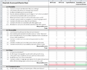
This evaluation had 61 criteria grouped into 10 categories. I based these questions and categories on work by Abby Covert included in The Content Strategy Toolkit written by Meghan Casey.
Because Fannie Mae is a data driven organization, I created a custom scoring system to quantify these subjective questions to internal stakeholders.
I ranked each item on a scale from 0 to 3:
0 = Fails this evaluation criterion
1 = Needs significant improvement to meet this evaluation criterion
2 = Meets this evaluation criterion but could be improved
3 = Meets this evaluation criterion and does not need improvement
As part of this heuristic evaluation, I tested readability and accessibility on a sample of the pages from each section on Fannie Mae’s site.
The content heuristic plus the GA data proved my theory.
The menu labels on Fannie Mae’s site had a low information scent.
Telling the difference between menu items required a lot of work for site visitors because they were almost identical from section to section. They also used terms that for customers new to the mortgage industry bordered on nonsensical jargon.
I needed to improve this labeling to reduce confusion and get people to the information they needed.
To get to the right navigation for Multifamily, I facilitated workshops with stakeholders. We collaborated through three rounds on grouping the content, and on how to label those groups. I strove to find a solution that would satisfy internal stakeholders and serve experienced and novice customers alike.
Ultimately, we raised the information scent by using a plain language approach. We chose labels that would help visitors better understand what content is in each section.

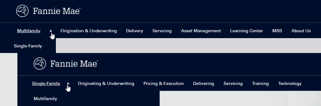
To increase the connection between the site’s sections during this multi-year project, I proposed unifying navigation mirroring navigation on the existing site.
This meta nav bar would live above each section’s navigation to orient site visitors. It showed a hierarchy among the sections. And the two sets of navigation gave visitors easy access to both Multifamily information and the rest of the Fannie Mae site.
Designing content types
A new architecture required new content types for the Aquia Drupal system Phase2 was building for Fannie Mae.
Because each business unit would have unique needs, I and the content strategist from Phase2 recognized the most efficient way to build the system was to use taxonomy on common content types.
Both Phase 2’s content strategist and I tried to convince internal stakeholders to develop and apply some governance rules to the content migration. Unfortunately, the Project Owner felt it would be better to migrate everything and sort it out later.
This meant that Phase2 needed a way to map the decades of content they would migrate out of Fannie Mae’s obsolete content management system.
We had to make sure we captured everything in the right places.
Defining the specific fields for each content type included the:
- Drupal field name
- Field Label
- Field supporting text (i.e. UX microcopy to guide content managers)
- Required status
- Type of content allowed in the field
- Implementation notes (e.g. limit field to 60 characters)
These definitions provided a road map for Phase2’s development team to build these custom content types.
Applying UX writing best practices to the field labels and field supporting text improved the UX for the content managers at Fannie Mae.
I collaborated with the content strategist from Phase2, a CXD visual designer, and a CXD UX strategist to create landing pages for the top level nav items and how they would work with the content types. I created and refined the content type definitions and the taxonomies as requirements shifted and changed.
Our modular approach to content types created flexibility when it came to the content strategy for each landing page.
Easing reading
I tested readability on Fannie Mae’s public web content as part of my quantitative evaluation.
Controversial as it can be, readability scores gave the team responsible for the content a place to start with improving the user experience.
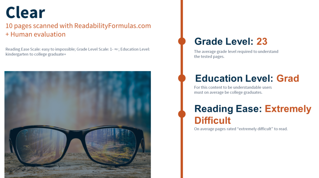
I used these readability scores to convince content owners to embrace writing for usability best practices.
I created a custom training for them that over the next two years I would iterate into a training for CXD’s Design Academy.
Impact
The redesigned version of Fannie Mae’s Multifamily website launched in July 2019.
Customer account reps in Multifamily reported an immediate decrease in the number of calls that included requests for information now easily found on the site.
Centralizing this information in one place improved governance for content owners who had been maintaining a separate directory so they could easily find documents outside the website. The cascade effect improved content governance for Fannie Mae as a whole. This meant the website became the source of truth for Multifamily’s information.
After taking the writing for usability training I custom designed for them, Multifamily content owners were able to reduce the average grade level on revised content from a grade 23 to a grade 8 educational equivalent.